Harbor House UI/UX Design
Dec. 2018
The Harbor House brand is inspired by The Harbor House Inn, a historical landmark of the rugged Mendocino Coast since 1916. It offers a relaxed, casual lifestyle that is perfect for any home. Each collection is designed with a casual aesthetic, bringing in natural elements through fabrication and motifs.
More than Ecommerce Customer Experience
Traditional furniture website is usually designed for highly responsive pages on desktop version while their mobile version isn’t so appealing or responsive. Unlike such a traditional way of design, Harbor House has highly optimized websites for both the mobile and desktop. Mobile-first indexing is the new design principle.
PAIN POINT
According to the Google analytics, our main B2C website www.designerliving.com shows the amount of traffic received from mobile devices and desktop devices are almost the same, but only less than 10% of checkouts are made on mobile devices. This discrepancy provides a great guidance for our new Harbor House website design to boost sales on mobile platform, so the first problem is to smooth the buying process on mobile platform.
SOLUTION
Base on the data I got from designerliving.com, there is similar amount traffic from desktop version and mobile version, but there is only 10% of customers decided to checkout with mobile version.
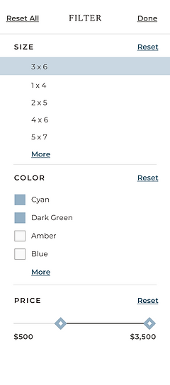
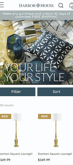
Simplify the mobile filter page.


Highly engaged product details page.


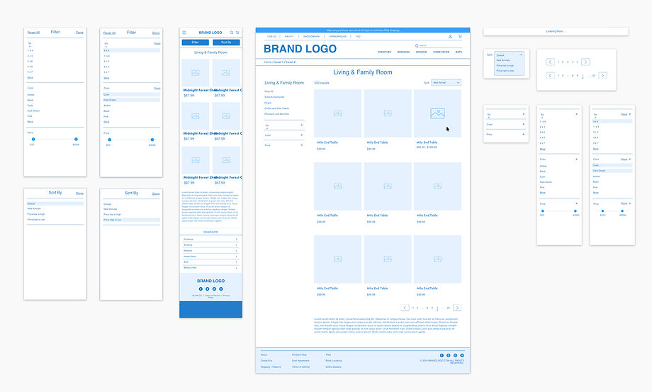
WIREFRAME

FINAL


